Having any sort of graphic ability, like any art form, can be both a blessing and a curse. One item I’ve struggled with over the years is the design of my personal logo. What I’ve found is most people in the photographic business don’t care what their logo looks like… or even have a logo beyond their name written in some fancy font. But a logo is like any other form of style announcement – it’s you wrapped up in a clever image or word. Even with all that knowledge, I’ve always struggled with what that logo would be for me. Perhaps that says something about knowing who I am or what I want to be when I grow up. I know, all very deep. I struggled with what font, what colors, why a logo, how complex, needs to reproduce easily, etc, etc. I have Corel files (yes, when Corel was more popular than Illustrator) that have endless versions of the same logo as it morphs from one logo down the page to a completely different one. There was never a satisfactory solution. It always ended the same way. “This one is decent and I’m tired of looking at this”.
I ran with this logo and font for several years. Various versions of it took shape depending on my needs at the time. The dotted version was added to the cover of my photo portfolio and is still there today.


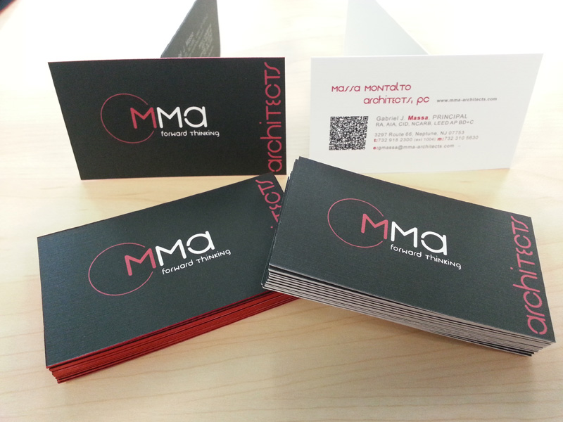
This logo came late in 2004 and ultimately replaced the previous logo. I had everything I needed. Graphically interesting layout, colors, and my initials to seal the deal. It was used on my most recent promotional card as a partial background.