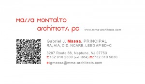
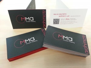
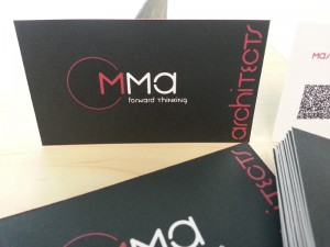
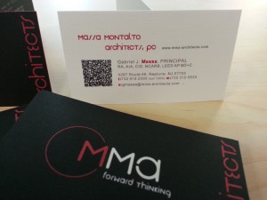
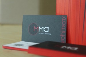
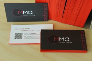
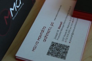
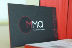
Almost every architecture firm that I’ve worked for has struggled with its branding/identity. Always up for a new graphic challenge, I generally thrust myself into the mix to stir things up a bit as well as offer my design input, asked for or not. MMA was no different. Using a very old and tired format, the staff agreed that a new look, not only for the business card, but for the logo in general needed to be developed. Here’s a few images of the later stages of the design process for the business cards. The logo design ended up being a product of the card layout.
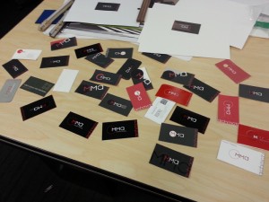
Many of the early designs, printed and cut to help understand the proportions and layout.
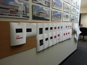
The “pin up” method was used so that the staff could weigh in and give feedback. This also helped us to easily revisit old concepts and sleep on the new ones.
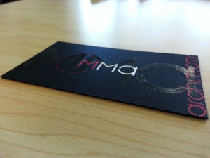
A last minute attempt to add another layer to the card.
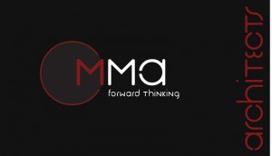
The final, accepted design.
In house printing. Each side was printed on a separate piece of paper, bound together and cut out individually. The red edge was again, another attempt to add a new dimension to the cards. Ultimately, it was accepted and printed.
Printed.

